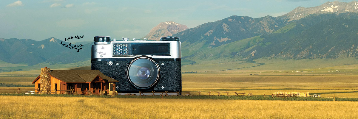
Welcome to part 2 of the Marketer’s Guide to Photography from Ultra Graphics. In this article, we’ll be discussing photography tips, tricks, and good practice. Missed part 1? Read it here.
This guide exists to give marketing professionals the equipment and skills to make their product/service look its best while keeping within a budget, and will be split into three main sections:
- Equipment – which camera and accessories are the best for your marketing needs
- Tips & Tricks – overall good practices that apply to all photography.
- Software – what can you use to edit your photography?
Disclaimers:
- The purpose of this guide is to be a simplified summary of photography equipment and methods for marketers that want to be able to take better photos for their marketing campaigns or advertising, but at the same time do not want a full fledged photography lesson.
- This guide will maintain focus on photography, not video (although many of the current DSLR cameras offer a decent video capture option).
- This guide and all the recommendations can (and should) always be passed through the filter of “knowing your customer.” The kind of camera or lens you choose will reflect the kind of photography you need for your business. The kind of software you use will depend on how you plan to edit and share your photography. As you read through the rest of this guide, be reminded that what works best is what works best for your message, and showing your customers the products and services in the best light possible (pun intended).
- The author is not a professional photographer, but a print and web designer with plenty of experience in advanced DSLR camera use and photo editing software.
Section 2: Tips & Tricks
Now you have the equipment, and you’re snapping pictures like crazy. For many marketers, it will be enough to switch the camera to “auto” or “guide” and call it good. The auto mode on a DSLR camera will admittedly be good enough in most cases, and a huge step above what previously was most likely a low resolution cellphone picture, but if you want to have absolute control over the elements of your image, manual mode is the way to go. In this next section, we’ll go over recommended practice & some basic photography composition and lighting rules.
First, a recommendation for taking photos with your new DSLR:
RAW vs JPG: I cannot stress enough that you need to shoot in RAW. RAW is an image format that is available in the image quality options of DSLR cameras that allow the camera to capture many times more data that if you shoot in JPGs. When shooting with JPGs, the camera takes built-in image presets such as sharpening, color temperature, color vibrancy, etc… and then applies various additional settings and filters to new images before they’re saved onto the memory card. Some involve automatic noise reduction, additional color vibrancy, distortion reduction, etc… Many of these are intended to improve the quality of the finished image, but what is essentially happening is the camera making changes to your images without your input.
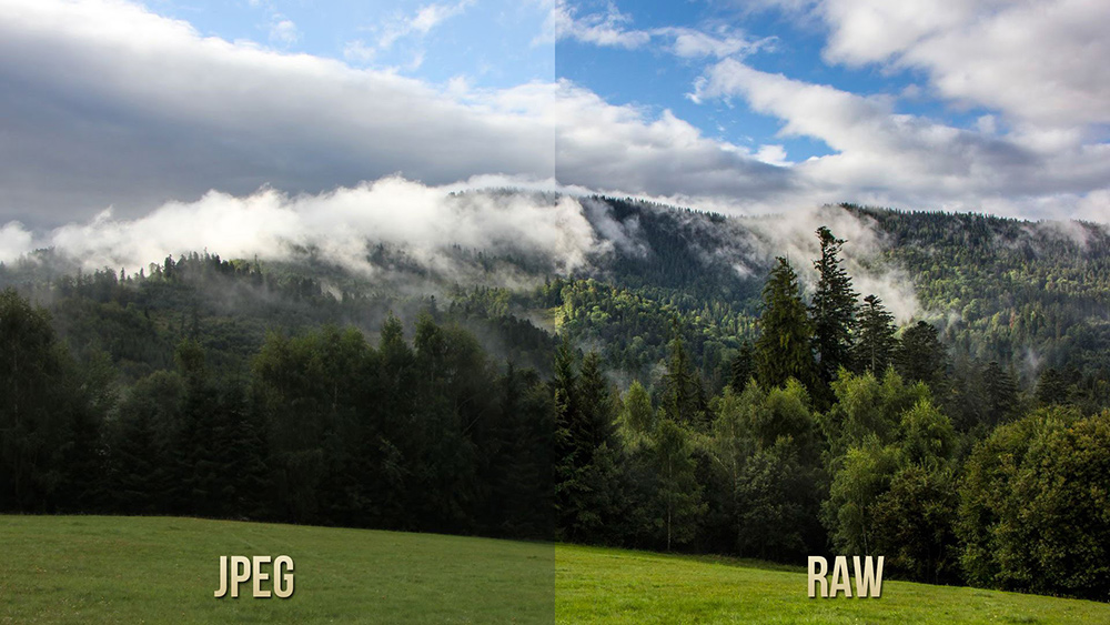 When you shoot in RAW, the camera records only what the sensor sees without applying adjustments. Not only that, RAW records so much more light and color information compared to JPG that it makes editing much more flexible. If for example you take an image and it turns out to be too dark, a JPG will have very limited editing options to lighten it up – requiring custom masks and potentially multiple layers of adjustment. A RAW image that is too dark can easily be lightened by simply increasing its exposure in a RAW image editor. You can increase color vibrancy, adjust colors and tones individually, and essentially just have more control over the image. Why is this important? As marketers, we know the value of being able to adjust our images to elicit the response we want, such as adding a color cast, deep shadows, filters, etc… Check out this great RAW vs JPG comparison video from youtube.com’s SL Studio:
There is a downside, however. Because the camera doesn’t apply many adjustments to RAW images they usually need a little work, because the camera is giving complete light and color control over to you. Also, because RAW images contain so much more information, their file size can be many times bigger than a jpg. Many DSLR cameras also have the option to save RAW and JPG images simultaneously, so make sure your SD card has the space!
Quality of Light: How you portray the light in your photography can have a dramatic effect on how the viewer perceives and is affected by it. For example, pictures of a warm sunny evening can often have a softer, warmer light – often with a subtle lens flare and/or light “bleed” that gives it a welcoming and soothing tone. On the other hand, photos with a cooler desaturated color palette with a darker light and deep shadows can create a sense of mystery, foreboding, or melancholy. If you take a look at just about any Instagram feed, you’ll see examples (some of which are mind-meltingly overdone) of filters and other effects that change the light temperature and structure to change the image’s feel.
Some of these effects are enhanced or even created from scratch via editing software programs such as Photoshop, Lightroom, or iPhoto. What is good to know, however, is you can control a lot of the light quality simply by being aware of your shooting environment. For example:
Clouds: A lot of people have the misconception that the best photos are taken on a cloudless sunny day. While that’s true for someone whose goal is to capture harsh dark shadows and lots of contrast, the reality is a lot of good photography happens on the cloudy days, the overcast days, and days when clouds serve as a gigantic light diffuser for the sun. When clouds diffuse the light, they soften shadows, disperse light, and even out tones. If you have to shoot outside, wait for a cloudy day! No clouds around? Look for shade from structures such as tall buildings and trees (but keep in mind that you’ll need to compensate for the darker environment).
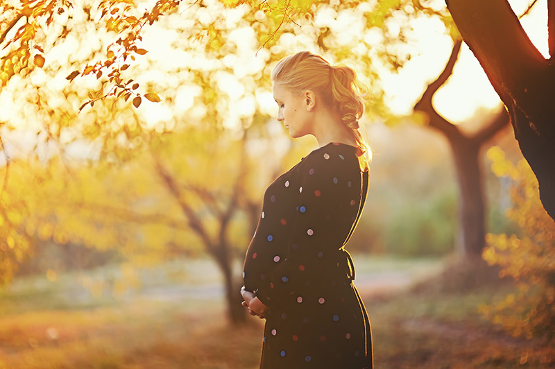
Sunrise / Sunset: A well known photographer’s rule, the so-named “magic hour” exists when the sun is either just about to rise or has just set. Similar to clouds diffusing light, when the sun has no direct rays on your photos (like when it has just set) it provides completely diffused light, removing harsh shadows. It also gives the light a warmer tone, perfect for skin tones and welcoming landscapes. Many photographers utilize the magic hour for portraits, family shoots, and engagements/weddings, but it can do wonders for landscapes and photos in nature too.
White Balance: There is a setting on DSLR cameras that attempts to mimic and compensate for different light types when shooting. For example, a fluorescent light in an office building puts off a different temperature than natural sunlight, which is different than yellow light bulbs. Most times it works to let the camera decide on the light temperature, but you can manually set it before shooting to ensure the right one is used on your camera. If you shoot in RAW, this can be changed after the fact in a RAW editor, so don’t worry too much about it!


Composition
Photo composition can mean the difference between a mediocre photo and an amazing photo. Simple adjustments can help show your product or service in a more appealing light just by changing your angle of view, or giving a little more thought to the background or color. What follows is some universally accepted compositional rules to help you improve your photos.
Rule of Thirds: The most common photography composition rule is the rule of thirds – most people who have spent any time with a camera have probably already heard of it. The idea is that if you were to take your view rectangle and split it into three equal sections both horizontally and vertically, you would end up with 9 sections. The important elements of your photo should either be placed along the dividing lines or at the intersections between two lines. This is of course not an absolute requirement for all photography (rules were meant to be broken!) but what it does is teaches you that many times a more interesting composition can be achieved by NOT putting your subject smack in the middle of your view. Many cameras have a built in “rule of thirds” overlay that you can add to the viewfinder, you’ll find it in the settings menu.
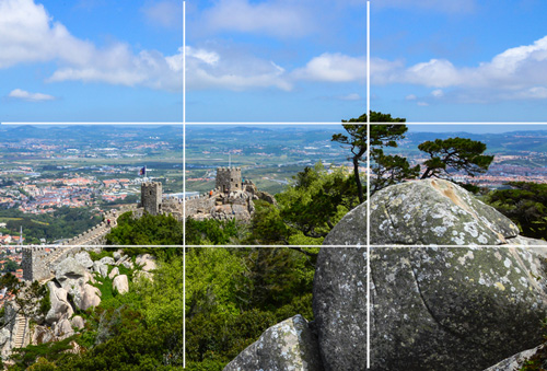
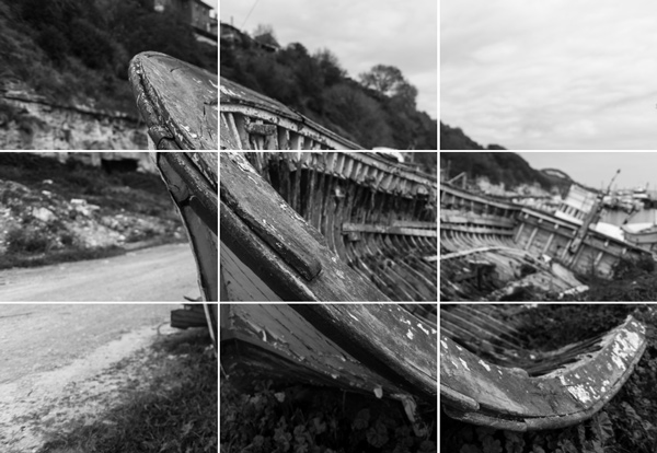
Leading Lines: When looking at an image, the human eye naturally follows and makes connections between elements, both literal and implied. For example, in the landscape above, there are leading lines in the horizon, or the line of trees leading to the focus tree at the top of the hill, etc… In the boat example, the outer shape of the boat leads the eye to the top left corner. Use leading lines to guide your viewer to the important elements in the image, in addition to helping them navigate around the image. Leading lines are useful for a marketer when they are composing a “scene” for their product, and using leading lines (and the rule of thirds) allows them to guide their customer toward the focus of the product.
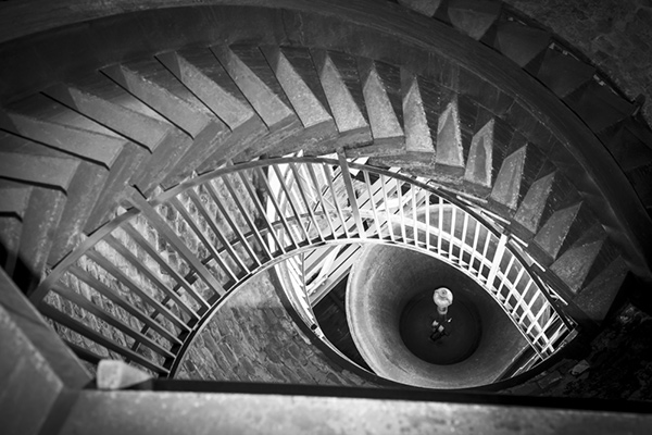 Patterns and Symmetry: Patterns and symmetry are two visual phenomena that are everywhere in nature – anything from the spiral pattern of leaves on a sprouting tree to the complex and beautiful hexagonal pattern of a honeycomb. The human eye is naturally drawn to and interested in patterns and symmetry, so using that to your advantage will ensure that your images always get a second look. To give a practical example, here at Ultra Graphics whenever pictures of a print piece are being taken, we always try to use multiple pieces fanned out, or stacked, or in some sort of pattern that makes it more interesting than just one piece on a table.
Background: When trying to photograph a product, in most situations the main goal will be to focus on the product right? Also, putting the product in a scene with other elements is a natural choice to make the image more interesting and appealing. The background can help guide the viewer to your product by using leadlines lines, textures or patterns – or it can be a distraction from the product and cause unnecessary confusion. When deciding what the focus will be for your image, don’t make the mistake of composing too many distracting elements in the background that will cause the focus to get lost.
The Human Element: It should come as no surprise that most humans like looking at pictures of other humans. That’s why a friendly face on the cover of a brochure gives it a welcoming feel, and why websites put pictures of nice looking people with headsets that say “operators are standing by!” to drive home the impression that you’re important to them. When taking pictures of your products, services, and locations, consider adding a human element to make the picture feel more friendly. If you sell coffee, take pictures of a nice person holding a latte with a smile instead of the latté alone on a counter. If you sell jewelry, take pictures of rings and necklaces on real fingers and necks. Not only does it give a friendlier tone to the image, but it’s also a built-in scene with natural color and warmth.
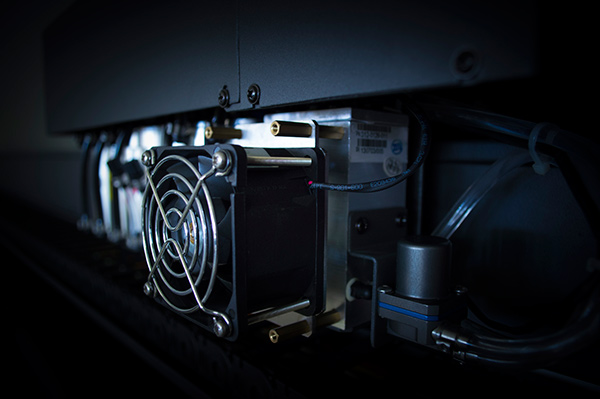
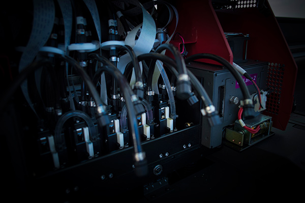
That should be enough to get you thinking about the images you’re taking. These rules and guidelines exist to give you a basic understanding of “good” composition, however, they also allow you to learn when it’s ok to experiment. When taking photos for the purpose of generating interest and intrigue in order to ultimately make a sale, it’s in your best interest to think about and photograph your products in new and interesting ways. Use different angles, put your products into a scene, photograph them in use, crop the images to create a sense of mystery – essentially do whatever you can to make them interesting! For example, some of you might remember the “teaser” photos I took when we first got our new EFI H652 flatbed printer (learn more about that here). To try to generate interest, I took small complex mechanical shots with a small depth of field and a close-cropped view to create a little mystery into what is a very powerful and versatile machine:

Summary
This brings us to the end of part 2! I hope that this article helps you get more comfortable with the concepts of color and composition, and allows you to show off your products and services in a better way! Please share this article with others you think would benefit, and if you learned something that lead to an awesome photo, we want to see! Want to continue? Click here for part 3. Thanks for reading!
~ Dan
