
A website’s navigation is the roadmap to your content, and the main method of interaction with your visitors. If it’s not up to snuff, it can lead your users down a frustrating rabbit hole of unnecessary clicks and wasted time, or at the very least lead them away from conversions such as contact forms, quote forms, or purchases. Master your website navigation by having a well-structured sitemap, organized and easy to use navigational menu, and secondary navigation menus as necessary. Keep a watchful eye on page links and orphaned pages, and consider using breadcrumbs to give visitors a visual path. This article will discuss all of the above, as well as give some SEO tips related to website navigation. Read on!
Section Links:
Benefits of Good Navigation The Website Sitemap Main Navigation Menu Secondary Menus Content Outside Other Navigation TipsThe Benefits of Good Navigation
When your visitors can find what they’re looking for quickly and efficiently, everyone wins. Nobody wants to find the information they’re looking for slowly, or find it after a dozen redundant clicks. Good navigation means putting the most important content front and center, and providing an easy path for visitors to access the rest. As an extremely important side bonus, good navigation and a well structured website helps the search engines like Google crawl and index your site more efficiently, which leads to better, more relevant search results.
The purpose of this article is to break down the concepts of website navigation in a simplified way to help website owners understand and implement improvements. Navigation is such a huge part of a positive user experience (along with content, site speed, and others), and when happy users become potential customers – making user experience a priority becomes a no-brainer.
The Website Sitemap
The sitemap serves a couple purposes during the lifetime of a website. During pre-development and planning stages, the sitemap is a way to organize and optimize the site’s structure by putting all pages (and posts) into an outline, and gives the website owner the ability to think about where, how, and why those pages need to exist. In many cases, a sitemap is a precursor to a website – and is something that should be at least top of mind during the planning and design stages. That doesn’t mean that sitemaps can’t be adjusted and improved for an existing site, it just involves a little more work, using things like 301 Redirects.
For existing sites that already have plenty of pages and posts, a sitemap exists as an outline for the search engines, giving them a route to crawl and index. Many sites use plugins (in cases of WordPress) that automatically create structured sitemaps in an XML file for consumption by search engines, you just have to tell them where to look. Unlike the planning/pre-production sitemap, these auto-generated XML sitemaps include EVERY page or post on the site that the web owner has not explicitly asked search engines not to crawl.
Below is a simple example of a pre-development/planning sitemap outline:
- Home Page
- About Us
- Our History
- Our Staff
- Services
- Service #1
- Service #2
- Service #3
- Product #1
- Product #2
- Contact Us
Each top level bullet is a parent page (in the navigation menu, often called a “tab”), and each indented item is a “child” page (or subpage). Using this child/parent structure, you can easily see how the website is laid out using a clear and defined hierarchy that humans and search engines appreciate.
Many times, this pre-development sitemap can be used as is for the main navigational menu of the site. In that case, the “child” pages would be dropdown menu items that appear when the user hovers over the parent (often called a submenu). Take a look at our own website navigation to see how this method works, and how child/sub pages can help organize information. Typically, a child page would have the parent page’s url identifier (also called a “slug”) in it’s url, like so: http://mywebsite.com/about-us/our-staff/ (where “our staff” is the subpage, and “about us” is the parent page). This helps cement the page hierarchy while also helping create accurate breadcrumb navigation (more on that later). When using WordPress, creating page hierarchy is as easy as assigning a parent page in the page editor.
Don’t assume that the sitemap you’ve created HAS TO become the navigational menu, because not all pages need to exist in the navigation as long as they’re linked to from somewhere (more on that later), just use the sitemap as a way to visually organize your content.
Main Navigation Menu
The main navigation menu is a series of links that exists towards the top of every single page, and is there to give visitors quick and easy access to most pages of the site. If we were to translate our sitemap above into a menu, it would look like this (with example dropdown submenu):

Some websites have their navigation on the side, some in other various and sometimes-confusing places, but the majority of modern sites have it at the top where users can locate it easily. The main navigation needs to be a place where the visitor can find what they’re looking for, whether that’s clicking directly to a page that exists on the menu, or leading them on a path that results in their question being answered (ie what products does this website offer, or how do I install/assemble/use/repair it, or what is the return policy).
There are a couple important things to remember when crafting a main navigation menu:
- Keep it organized and succinct: the sitemap prep will help with this, but try to avoid a dozen top-level tabs if you can. Most typical organizations won’t need more than a half dozen top level tabs – everything else logically fits as a subpage/dropdown.
- Make sure it’s mobile-friendly: In a menu that has lots of top-level items, dropdowns, sub-pages and sub-sub-pages, navigating on a mobile device can be challenging. Most modern WordPress sites and themes have a mobile-specific menu that simplifies the interactions by using tap-to-expand submenus and bigger buttons.
- You don’t have to force every page into the menu: We talked about this earlier – don’t feel like you have to fit every page into the menu. The important thing is making sure that the visitor has a clear and defined path to content, which means a menu item could point them in the right direction then the resulting page could guide them further. For example, you could have a link to a “blog” or “recent news”, but wouldn’t put every news or blog post in the menu as well.
Secondary Menus and Call to Action Links
There are plenty of cases where a second menu makes sense. For example, if you have a site that has too many menu items to fit in the main navigation, or you want to separate the e-commerce portion of the menu into a different area (shopping cart, account page, etc…), or if you have a specific call to action that you want to highlight so it stands out (shop, donate, sign up now, volunteer, etc…).
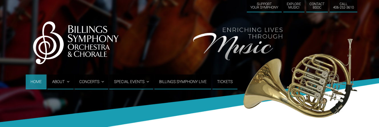
Secondary menus can be just about anywhere – such as the site footer, a sidebar, or at the very top of the site above the main navigation menu. The key is to help the user know when to use it, and to not overpower the main navigation. For example, on the Billings YMCA site, there’s a secondary menu in the top right. And on the Billings Symphony, a similar secondary menu. There are tons of great uses for secondary menus that show the user how to get around.
Content Outside of Navigation Menus
Like I mentioned before, there’s nothing wrong with pages or posts that don’t end up in the main navigation menu – as long as there’s a clearly defined and guided path to get the visitor there (and how to get them back). You accomplish this by using the links within and between pages. In the blog/recent news example, the main blog page would have a series of posts, and each post has a link for the user to progress further. In another example, a website sitemap could have a main page for “services”, and within that page have links to a page for each individual service. Even if the individual service pages don’t end up in the navigational menu, they still are linked to within the site and can be found organically when the visitor clicks “services”.

What you want to avoid are “orphan pages”, which are pages that exist on the site but aren’t linked to from anywhere else. They can show up on an auto-generated XML sitemap, but if nothing is linking to them, search engines like Google consider them to be very low-value (why would the page be valuable if nobody is linking to it?). If there are lots of links to a page, then it can be assumed that it’s important and therefore valuable to the visitor.
Some unlinked pages can be created on purpose – pages that aren’t supposed to be found unless the user completes certain actions (like a “thank you” page after a contact form submission) and you don’t want them skipping to the end, especially if you are using that page to track conversions via Google Analytics. Some other orphan pages exist because they’re not public-facing, such as business-internal pages, password-protected pages, etc… In these cases, you don’t want the user finding the page by accident – and would take steps to suggest to search engines not to crawl or index them all using the “noindex” or “nofollow” meta tag. It is of course up to the search engines to honor this request.
 If your site has dozens of pages that exist outside of a primary or secondary navigation menu (or if you just want another way for visitors to see where they are and where they’ve been), then it’s a good idea to implement a breadcrumb navigation system. Breadcrumb navigation performs a lot like its fairytale namesake, where it shows the current page the visitor is on and the path to get there. Many breadcrumb navigation menus are at the top of the page right under the main navigation menu, and look similar to this:
You are here: Home → About Us → Our Staff
The last page in the list is the current page the visitor is on, and each preceding page is working back up the hierarchical path to the home page. Typically, each of the preceding pages is a live link, so the visitor can click any of them to back up. For breadcrumb navigation to work, the sitemap need to be structured with a series of parent/child relationships between pages like we discussed above.
Breadcrumb navigation doesn’t need to work with just pages either. It can work with blog posts, blog categories, e-commerce products, even image galleries – but the concept is the same – to show the visitor where they are, where they’ve been, and how to get back.
Some Other Navigation-related stuff
Here’s some other tips and tricks related to navigation and it’s connection to SEO that might help some website owners wanting to learn or do more for their visitors:
- Submit your sitemaps to search engines: here at Ultra Graphics, we submit sitemaps for newly-launched websites to Google and Bing, who have the lion’s share of the search engine market. For Google, you use Google Search Console, and for Bing you use Bing Webmaster Tools. For each, you have to add your site to an account and usually perform some sort of verification to prove you are the domain/website owner. After that, you can submit the sitemap to them by providing the URL where it lives (ex. https://domain.com/sitemap.xml).
- Navigation Placeholders: There are some situations where you want to display a collection of sub pages but have no parent page to assign them to. In these cases, you can create a “placeholder” top-level navigation tab that links to nowhere, just to have a place to put a subpage menu. Typically you have the top-level page link to “#” which is just a hashtag that does nothing. Keep in mind, if you have no actual parent page then your breadcrumb navigation might miss a step unless you manually code it in (as opposed to using an auto-generated breadcrumb navigation).
- Top-Level Tabs that have dropdown menus: Most dropdown menus appear when you hover over a top-level tab in a menu. Sometimes this can indicate to the visitor that the top-level tab isn’t an actual page, just a placeholder for the dropdown menu. This goes double for mobile devices because there is no “hover” state – you just have a finger tap. To get around this, some menus add an icon or some other indication that there is a dropdown menu, or a mobile tap that translates into “open the submenu” instead of directly visiting the link. While this is great, I also like to add the parent page into the dropdown menu as well just in case the user doesn’t know that the top-level item.
- Sticky Menus: Some menus can be made “sticky” which means that they adhere to the top of the website and follow the visitor as they scroll down. This can be helpful in that the main menu is accessible no matter where the visitor is on the page. Keep in mind, mobile device support for sticky menus is average at best, so most website developers choose to deactivate it on mobile. Sticky menus also work great for call to action buttons like “donate” or other important buttons like a shopping cart.
- In-Page Anchor Navigation: sometimes your visitors can benefit from in-page navigation using HTML anchors. They are still technically links, but they have the ability to link to a position on a page. They work awesome for longer form content, kind of like chapters in a book. This article uses in-page anchor navigation!
Now, the caveat: There are exceptions to almost any website rule. The goal here is to build a site navigation that works for your target visitors. In our opinion, the guides and examples above apply to most business and/or non-profit owners. Please feel free to contact us if you have any questions or would like to discuss the topic further. Thanks for reading!