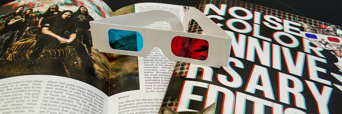
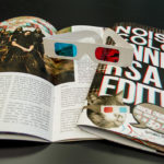
Quite fitting that a magazine named “Noise & Color,” now in their third year of publication, would print what, at first glance, looks blurry. In reality, the magazine is in 3D – complete with detachable 3D shades on the inside cover. Not only is the magazine itself creative, but response from their advertisers (who had the choice to opt in for the 3D ads for an additional fee) has been amazing. Advertisers have even called in to the magazine afterward to personally thank Noise & Color for their placement.
Imagine: a reader opens the piece, curious about the mystery of what images are and aren’t 3D in the magazine. He or She dons the 3D shades, and finds along the way little easter eggs of 3D interspersed between articles, images, and ads. Those ads stay with the viewer far longer than the normal 2D experience, no matter the real estate covered on the page.
For their recent anniversary, Bryce Turcotte – Executive Director, and Wayne Wilcox – Chief Financial Officer, wanted Noise & Color, a 3500 monthly Montana-bred publication, to rise above the monotony of area publications. Enter the world of 3D publications. It’s not as simple as just creating three images, one in full color, one in magenta, and one in cyan. Painstakingly, designers must pour over the artwork layer by layer, creating multiple “depths,” in each part of an image, to accomplish the appropriate effect and direct attention to a particular element in the artist’s (and reader’s) eye. The result of all the effort is a beautifully captivating piece of Billings’ culture, and one that will no doubt raise the level of print creativity in our area.
Check out the gallery below showcasing some of the magazine:
Learn More about Noise & Color Magazine on their facebook here
