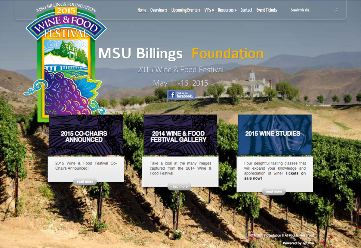
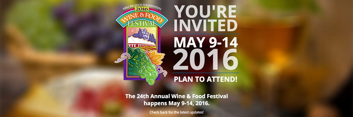
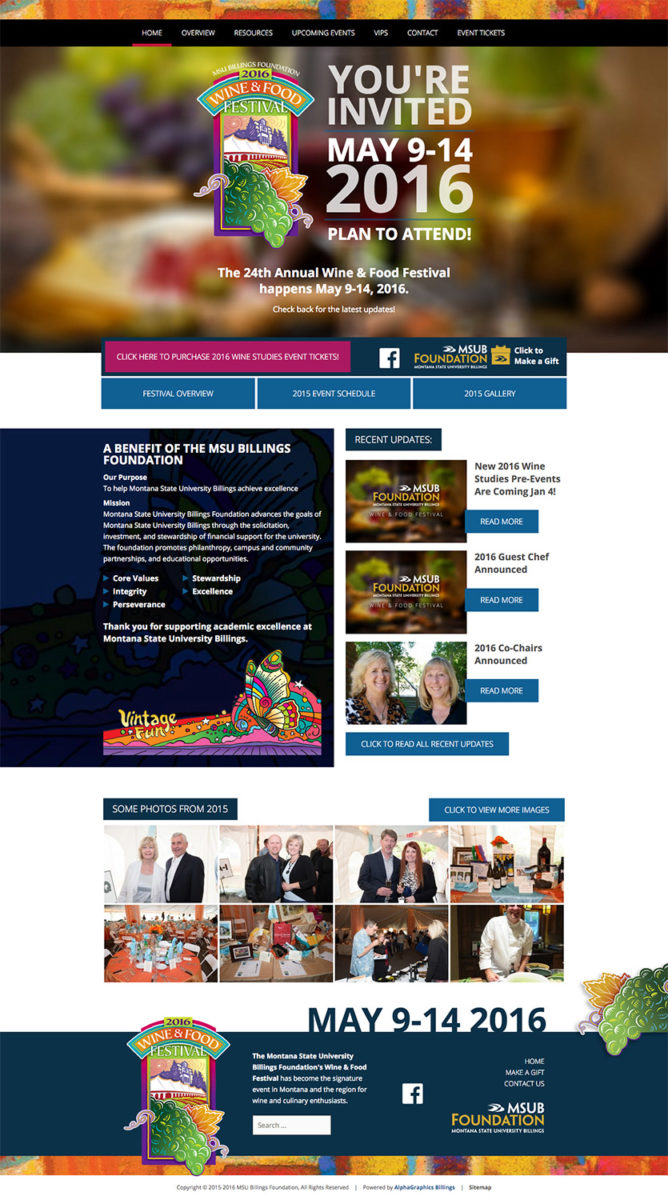
Ultra Graphics is proud to announce a recently completed redesign of the MSU Billings Wine & Food Festival website. During the design and development stages, we identified and addressed a number of pain points related to the existing design and functionality. Working closely with MSUB Foundation we were able to rebuild a modern and functional website to house all the dynamic content related to the festival itself as well as put a renewed focus on ticket sales for the festival and its pre-events. Jeanne Moller, the Development Officer for MSUB Foundation and our primary contact for the project had this to say about the new site:
“We are very pleased with our new MSU Billings Foundation’s Wine & Food Festival website – the look and the ease of navigation are two great benefits. We are also happy with the formatting for mobile devices and the security of the site.”

Although the existing site was originally well designed and functioned adequately, it was becoming out of date in the modern web design world and was plagued by issues on mobile devices and being able to handle the large amount of data that comes from the yearly festival.
The primary pain points for the site were:
- The site was not mobile friendly, and Google Analytics reports showed that an average of half the visitors were viewing the site on mobile devices.
- The design and user experience was suffering from longer loading times, and an outdated look that didn’t compliment the Wine & Food Festival’s modern brand.
- With no dynamic content structure in place (blog), there was no organized way to provide up to date news or announcements in a chronological, archivable way.
- Using an out of date WordPress Content Management System, the site was vulnerable to security breaches and spammers.
- While the customer had access and training to manage content, it was not as user friendly or intuitive as newer WordPress installations have become.
We addressed these issues in multiple ways, following a proven process for getting the right information while educating the customer and managing expectations. During a couple discovery meetings with Jeanne, we were able to get a feel for what the site was missing, and made some recommendations for improving the user experience.
 The priorities for the rebuild were to make the site responsive for mobile devices, and make sure that the wordpress installation was up to date and stayed that way.
The mockup was designed in-house by our web services manager, and inherited design elements from the Foundation’s printed materials to maintain a consistent brand image (the design inspiration comes from the excellent work by Heins Creative, here in Billings). It was designed to be responsive from the ground up, meaning it adapts and reflows to just about any device its viewed on. Using modern practices like flat design, clean fonts and colors, and high quality optimized imagery, we were able to create a site that is a pleasure to look at and to use.
We added a recent news section (blog) that allows a separation between the static content (which in the Foundation’s case was yearly content) and dynamic content. This gives them the flexibility to post updates and announcements that are automatically archived and chronologically organized, with pre-set categories and tags to allow effortless browsing. As the years go on, the site will naturally build a fully fleshed out archive of past year’s festivals, adding value to the site and to its users. In the same vein, we installed and configured a gallery plugin that will allow them to manage the hundreds of photos that are taken each year. Galleries can be created and managed, albums can be used to collect and organize galleries, and all of them can be placed in posts and pages with little effort and no required code knowledge.
In addition to putting the new site on the most recent version of the WordPress CMS, we built it using an updated theme that comes straight from the WordPress core developers, and added a security plugin that monitors and checks for dozens of potential vulnerabilities. Add to that the use of strong username and passwords, accurate folder and file permissions, and regular ongoing updates, the new Wine & Food Festival site has a very low risk of intrusion.
Finally, we build a series of shortcodes and presets to allow the customer to create beautiful dynamic content using the WordPress built-in visual editor. Shortcodes are small containers of code that allow someone not familiar with html, php, or css to utilize those languages in a user-friendly way. As a rule, we build a series of shortcodes that allow the customer to manage things like headers, multi-column layouts, and other design elements that are outside the realm of the visual editor. These tools give them the freedom to create more than just posts of text and images, and the ability to build content that adheres to the rest of the website’s theme.


