Experienced and professional designers have an eye for layout, composition, and color – gained from years of work and thousands of projects. For those not familiar with the concepts of design, building a pleasing visual for a marketing or advertising campaign can seem daunting. While the design is not the most important part of a campaign (that would be the audience and the offer), it can still mean the difference between a second look – and a recycle bin.
Whether you’re designing for print or online, for a billboard or a business card, here are some basic concepts you should learn to help your designs have the most impact.
Fonts
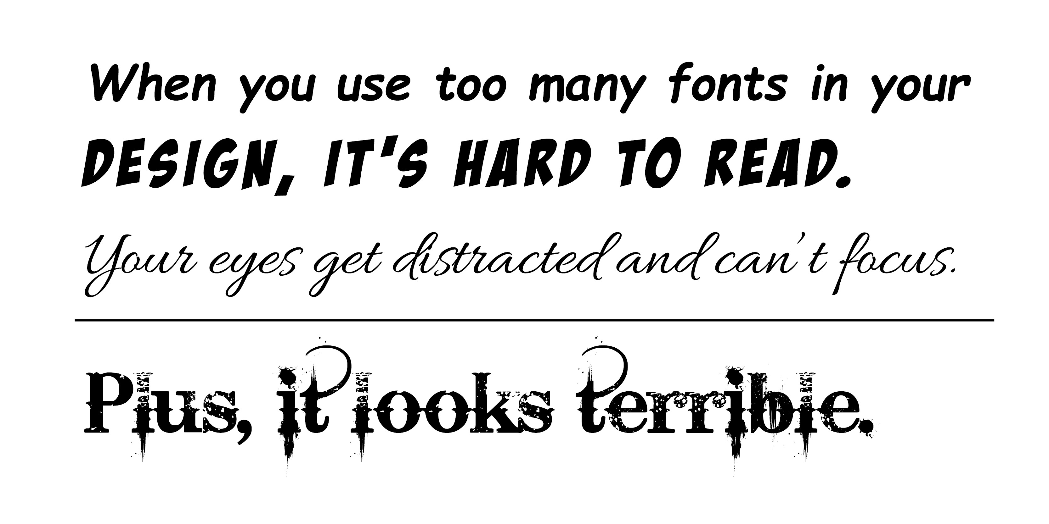
All typefaces have their own mood, and with the right one you can take your project from blah to powerful. Your design should typically only have one or two contrasting typefaces that complement each other (no more than three). This can also be accomplished by keeping it in the family, using a variety of styles from one font. For example, Roboto is a good typeface to choose because it contains many styles, as well as serif and sans-serif options, which when used together can add contrast. There are thousands of different typefaces out there, and it’s important not to get too carried away. Too many fonts can be confusing, and can make your design lose its cohesion, while potentially making your message hard to read.
Contrast
Contrast isn’t only applicable to font families and styles. If everything in your design is the same, it lacks contrast – and that’s a recipe for boring. Contrast is the state of being strikingly different from something else. You can create contrast in many different ways using size, fonts, color, etc. Having contrast in your design also helps put an emphasis on the important details or elements of your design.
- Add bold or italic fonts with your design
- Mix large type with small type
- Include a dark color or dark background image paired with white or lighter colored text
- Use complementary and opposite colors to create contrast with color
Alignment
There is a reason why every design program includes alignment tools. Aligning elements tightens your design and eliminates the messy, haphazard look, which can make your design look very chaotic (unless that’s what you’re going for). Alignment is one of the most basic, but important principles of design – especially for business-related visuals. Jacci Howard Bear, freelance graphic designer and author of How to Use the Principle of Alignment in Page Layout says, “Good alignment is invisible. Most readers won’t consciously notice that everything is lined up neatly. However, most viewers will notice when the elements are out of alignment.” Alignment creates order and organization and gives your piece a polished look and feel.
Color
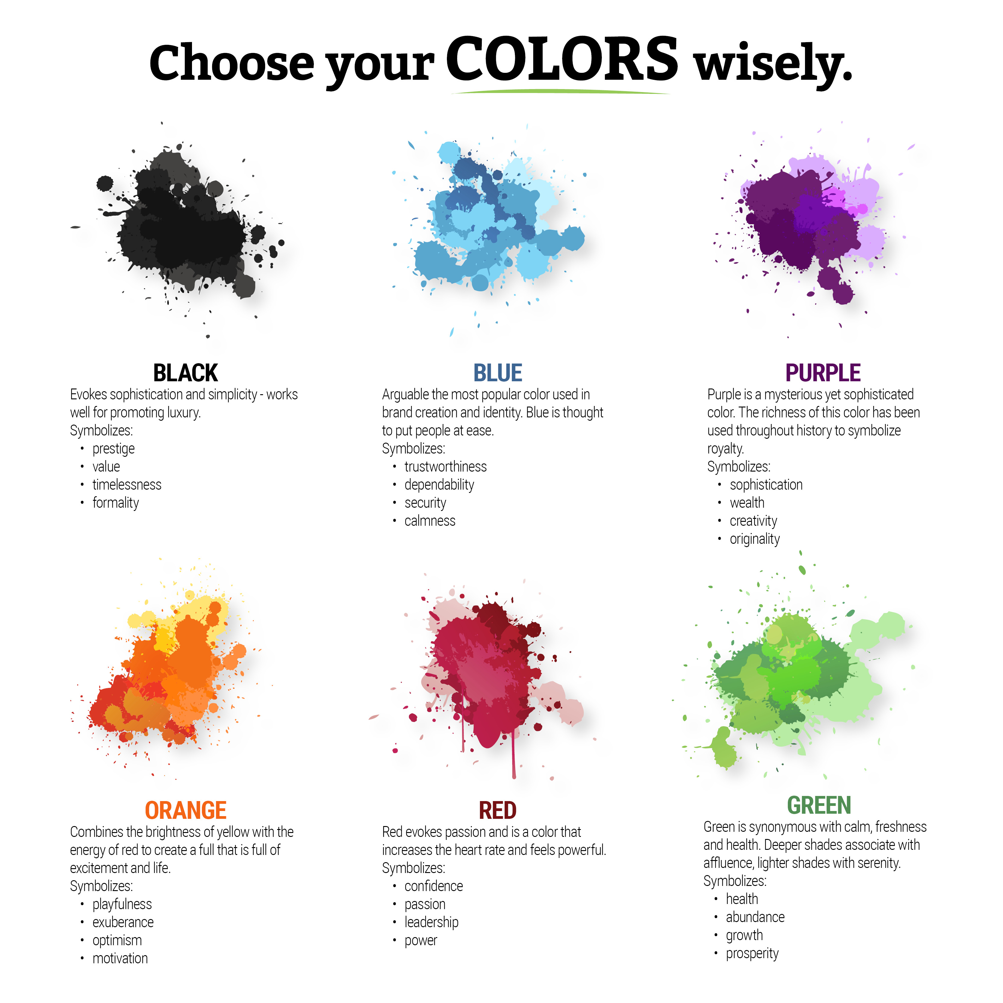
Choosing a good color palette is key to making your design visually attractive while putting emphasis on your message. We all know different colors can create emotions, which makes color an effective marketing tool. It can draw attention, set the tone, and represent your organization’s brand. In his article, Understanding the Meaning of Color, Joel Lumon Black states that color attracts your attention, changes your mood, and plays a major part in how we see or define things. Color has the power of persuasion.
Audience
Be sure to keep your audience in mind when creating your design. Just because you might like a particular style or design, doesn’t mean it will resonate with your customer. If you’re creating a piece for a professional law firm, you don’t want your design to be full of primary colors and whimsical fonts. A poster for a rock concert will have a completely different mood than a poster for an orchestra concert. You may have to do some research for your target audience, and that’s okay. It’s better to have a well thought out plan because the more you know about your audience, the better your design will be.
Space
Less is more is so cliche, right? But, it’s true. Our eyes are attracted more to a piece that’s sleek and clean over a cluttered, random mess. It’s like having a messy house, we can find things easier if our house is clean and organized, same with a clean design. Our eyes focus more on the text or elements we need to see. Negative space highlights the most important pieces of information and can help balance your design.
Does having white space in your design mean it has to be…white? In her article, Stunning Examples of White Space…That Aren’t White at All, Carrie Cousins explains that white space can be a solid color, or a blurred background or even a bit of movement. The common factor is that the space is just that… space. It doesn’t contain another content or design element. If the user looked past it or away from it, no information would be lost.
Let your elements breathe.
Consistency and Repetition
These two factors are especially important in branding. Having consistency and repetition in your branding is what makes your logo or marketing materials instantly recognizable. If you’re creating multiple designs for a particular campaign, be sure to use the same elements, patterns, fonts, icons, and colors throughout all of the pieces. Repetition can also be achieved by using repeated messages. If your organization has a tagline or mission, use it over and over so it becomes a part of the brand message.
If you’re creating a magazine or multi-page document, be sure your headings are in the same font, size, and style. The same thing applies with your body text and captions so you have a cohesive design that’s easily readable. This doesn’t mean you have to copy and paste the same group of elements on each page, but there should be some correlation on each page. Using repetition and consistency helps set the mood of your piece along with reinforcing your branding and message.
Simplicity
“I like it because it’s neat and simple.” I hear this phrase all the time. Whether it’s discussing a design or a process, we’re drawn to simple because we see immediate results. A simple design doesn’t mean it has to be boring. By keeping simplicity in your design, your piece will have more impact because there will be less distractions. To achieve this, go easy on the gradients and special effects. As discussed earlier, use one or two contrasting fonts and make a good use of your white space.
Hierarchy
Setting up good visual hierarchy in your designs makes it organized and easy for your viewers to find the information they need. There are several ways to accomplish this in your designs:
- Size – placement of primary text or graphics (more important elements) towards the top
- Position – we naturally read things from top to bottom, left to right
- Space – graphic elements or text that have more white space around them are easily seen and become the focus
- Color and contrast – use color and contrast to emphasize important items or text (think black and white with a splash of color)
Distortion
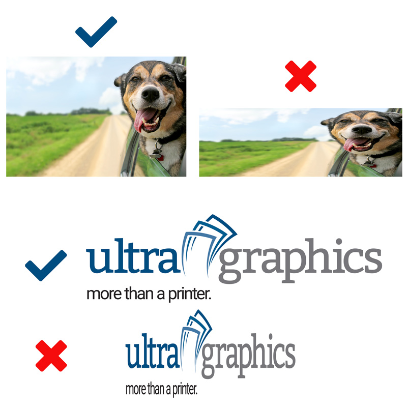
Logos, photo or text that have been stretched to fit a space and end up distorted are a huge no-no. Not only does that make your design look amateurish, but it’s also a good way to upset the logo designer or photographer. Distorting proportions of a logo is against every organization’s brand standards. Always be sure to scale your logo, photos, or text proportionally to maintain its original appearance.
Some of these design concepts may seem pretty simple and straightforward, but applying them effectively can be tricky. Graphic design is a highly coveted skill and the design world is always evolving. Every concept has its purpose – you won’t apply them all to every project you’re working on. Knowing when and how to choose the right ingredients will ensure you’re conveying an impactful message to your audience while maintaining a polished, professional design.
